Foreword
The role of photography in science has been a largely overlooked story in the literature of photographic history. Part of the story told well is the consequential role of nineteenth-century scientists in developing the early building blocks of the medium—optics, chemistry, camera technologies, and the theories of light and color. They, along with artists and enterprising promoters, instinctually understood the possibilities of photography for seeing the unseen, whether in the far-flung reaches of the celestial skies or in the molecular functions and structures of human and natural life. As a result, early science photographs, including the first photograph of the moon, taken by American scientist John W. Draper from his observatory in 1840, and the first X-ray image by German physicist Wilhelm Röntgen in 1895—among many other “photo science firsts”—held persuasive and pervasive power in advancing new avenues of scientific discovery and profoundly influencing the course of human knowledge.
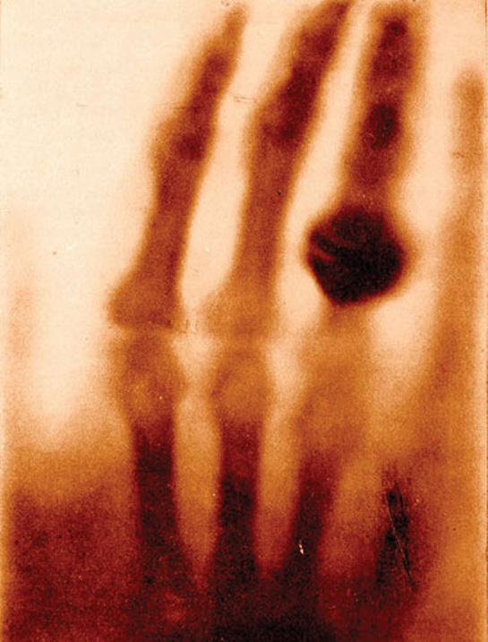
The radiograph features the hand of Mrs. Wilhelm Röntgen, captured in the first X-ray image, made in 1895. This image was originally reproduced in Otto Glasser’s Wilhelm Conrad Röntgen and the Early History of the Roentgen Rays, London, 1933. Image courtesy of the History of Medicine Collection, US National Library of Medicine, National Institutes of Health.
The story of photography’s role in science has continued unabated from then to now, and at an ever-quickening pace and with increasing cultural importance. From picturing the invisible realm of human DNA to exploring the rings of Saturn or viewing Earth’s global warming, photography and science are indispensable partners whose evolving story continues to shape the ways we know ourselves and our seen and unseen world.
The exhibition and allied publication Images from Science, now in its third installment, sought to reveal the contemporary storylines of photography in science and in new frontiers of scientific imaging. Leading experts from the fields of astronomy, medical photography and illustration, material sciences photography, and related industries served as judges of an international online competition to gather the best and most thought-provoking images, animations, and short form moving media currently at large in science photography and imaging. As in past iterations, a primary goal of Images from Science 3 is to produce a touring exhibition with international breadth. This was certainly true of Images from Science 1 and 2, which traveled to more than 35 venues worldwide. New to Images from Science 3 is an enduring website that better relates the importance of online technologies, social media, and evolving moving media forms to furthering the reaches and import of science photography to an attentive public.
A collaborative initiative in organization and support, Images from Science 3 counts among its sponsors a consortium of imaging powerhouses:
- Rochester Institute of Technology (RIT)
- Johns Hopkins University and School of Medicine
- Carl Zeiss Microscopy, LLC
- RIT Chester F. Carlson Center for Imaging Science
- BioCommunications Association
- Association of Medical Illustrators
- Histolite
- Service Photo, Inc.
- Science Source Images, Inc.
- RIT School of Photographic Arts and Sciences
- RIT School of Art
- RIT Press
With faculty and practitioners engaged in teaching and exploring scientific photography and imaging, these institutions confirm the interdisciplinary nature of the medium that posits new visual data across human and natural science by expanding evolving technologies in novel ways.
Images from Science 3, with its multiple allied pursuits, joins a growing scholarly and public interest in the present and future of science photography and imaging. Certainly, digital technologies of the late twentieth and early twenty-first centuries laid out a path for new visual discoveries, but so too did the professionalization of the discipline fields and the original means of display and image distribution. For almost 200 years, the partnership of science and photography has been nothing less than transformational. Beyond the ways it has informed visual culture, it shapes human knowledge and understanding, with new sight to observe the world and ourselves.
Therese Mulligan, PhD
Director, School of Photographic Arts and Sciences
Rochester Institute of Technology
More Than Pretty Pictures
I was recently asked a thoughtful question during the question-and-answer session following a presentation about my new book, Picturing Science and Engineering. In the book, I describe in detail everything that I have learned about making science images and figures. My “mission,” if I may use that word, is to nudge researchers to consider the value of making their “visual explanations”—images, graphs, figures, and illustrations—more communicative, not only to their colleagues but, just as importantly, to the public. The question was: “Do you first think about the aesthetics of the image you are about to make or do you first think about the science?” I had to think a bit before responding and then realized that I simply cannot separate the two. The science in the images that I capture is primary, and that science already has a stunning aesthetic component if I represent it carefully, honestly, and with the intention of communicating the information. The image should always be about the aesthetics and the science. You, the reader, should understand I am consciously not using the word “art.” I use the word “aesthetics” with the intention of suggesting “beauty.”
Over the years, I have observed many representations of science coming from various laboratories across the globe, where both the science and beauty are obscured. I have always believed my job as a scientific illustrator is to clarify the science and discover the existing beauty of an object or phenomena, to refine both of these qualities, and then nudge them to a place where viewers will want to look more deeply. With careful composition, editing, and lighting techniques, I can compose the information that is already present within the science. When I am effective, I can better communicate the information, while always maintaining scientific integrity.
Sometimes I wonder why the science and beauty are often difficult to see in images created by scientists. After all, most researchers are already seduced by the aesthetics of the phenomena they are studying. So why do we not always see that characteristic in their pictures? After conducting a series of master classes for many years on my campus and elsewhere, I’ve come up with some initial questions that I present to science and engineering students to help these scientist photographers gain a greater awareness of the value of creating more effective illustrations—without complicated set-ups.
Often, rather than relying on straight photographic documentation, I have to use other means to depict a scientific idea or concept because the concept itself cannot be photographed. This image, which appeared on the cover of Nature Materials, is a combination of photomicrographs, creating a metaphor to tell the “story” about the research. The scientists developed a technique to chemically protect an implanted device against the body’s natural mechanism of fighting any foreign material, depicted by metaphorically “deactivating” the macrophage on the left. Research: Joshua Doloff, et al. MIT. Image reproduced courtesy of Felice Frankel.
The first question I ask is: “Have you read your equipment manual?”
I have been surprised by how little researchers know about the basic operation of their expensive imaging equipment. I am not referring to astronomers, microscopists, or others whose knowledge about their equipment is the science and an essential component of their research. But I have found that those working at their research benches—fabricating devices, observing changes over time, studying various structures, or using cameras or electrons to document what they see—are generally missing the basics of imaging practices. For example, when I pose questions regarding ƒ/stops to those using cameras, I sometimes get blank stares. And when I ask what file size their scanning electron microscope (SEM) produces, it’s clear that some scientists are unaware that they can change the resolution of their SEM in order to capture a higher-resolution image (and produce a larger file) for a journal cover image. For many of these dedicated scientists, committing time to better understand their tools always seems to be tangential. To achieve better images, that attitude needs to change.
I next ask: “What is the first thing you want the viewer to see?”
The answers vary but, because scientists know exactly what to look for in their own images, they assume the viewer will see all the same things. This is a problem. My biggest challenge is to persuade researchers they are creating images and figures with too much information. In essence, they are making it difficult for viewers to “read” their images. When viewers see an image or figure for the first time, their view is not directed; they look at everything. There is no way of directing a viewer where to look or what to initially observe. In my attempt to urge better editing, I get polite nods of agreement, but later I see that few changes were made. The problem is that a researcher wants a viewer to see all the work they have produced, no matter if the content of one image is redundant to that of another. However, multiple images of similar fields do not necessarily communicate more information.
Another question I am curious about is: “Why do you not push the envelope?”
Too often, scientists perpetuate the notion that “this is the way it’s always been done.” They don’t consider the possibility that their images or graphics can better communicate their science if they re-evaluate “the way it’s always been done” and adopt a more contemporary process. Just because the software spews out colors for a visualization that a software engineer, and not an imaging expert, developed does not mean that it should remain the best practice. Consider, for example, the images created with an atomic force microscope (AFM). The software in this type of microscope always displays a rust-tinted visualization. The image is actually a grayscale rendition, but for some reason the tint was added years ago when the equipment was first developed. I raise the question in many workshops, “Why not convert this type of image to grayscale to make it more readable?” The common response is that an AFM image is recognizable because of its color. Should that be the reason to perpetuate a questionable aesthetic? Changing conservative minds is a slow process, but once a scientist sees the value in adopting more effective imaging practices, powerful and new imaging outcomes are possible.
Another question I ask, which can start some interesting conversations, is: “How far can scientists go when enhancing science images?”
How far a scientist can enhance, adjust, or “touch up” an image is a critical question in science and needs more attention in research communities. Moreover, we need to engage non-experts in the conversation as well. In our visually bombarded daily lives, where everyone sees themselves as a photographer, we need to discuss the ethics of image enhancement of any kind. In my book, I include an entire chapter about image enhancement; I begin by referencing a stunningly beautiful Hubble Space Telescope image that has been color enhanced. You might not know that almost all Hubble images are enhanced. I write:
If you think about it, the very nature of making an image involves a subjective decision from the start of recording evidence. It takes the form of deciding what and when to photograph. Thus it is a mistake to get bogged down with the idea that no enhancement whatsoever should be permitted. You already have edited the evidence by not including this, or that, within the frame. If we can agree that the purpose of visuals is not only to show evidence but also to communicate that evidence, then we can permit some enhancement to help the viewer read the information, as long as we specify exactly how the image was enhanced. How many times, while photographing a sample, have I left out an imperfection? Is that decision unethical? Am I manipulating the evidence? Or is it for clarity? The one important thread throughout the journals’ guidelines is that researchers must always indicate when any “enhancement” is applied to a photograph.
I push the envelope a bit more by asking: “Are researchers making their pictures a priority?”
Planning to make the best visuals for a journal submission or presentation should not be left as a last-minute exercise. It should be part of every researcher’s thinking from the beginning of an investigation. The power of pictures as a communication tool should not be underestimated. For that reason alone, learning to make science images that are compelling, informative, and accessible should be part of every researcher’s education. It is a skill that is as important as the writing component of a journal article.
When I first began this amazing and joyful journey as a science photographer 25 years ago, I was confronted with a strange idea that was presented by many young researchers. They thought that some of my pictures were “too beautiful” and that the science within the image would not be taken seriously because the work seemed to focus on aesthetics. I am delighted to report that that peculiar thinking has almost completely dissipated from conversations about my work. I believe science illustrators should scream to the world how astonishingly beautiful science is! And what better way to say it than with pictures.
This exhibition is testament to those who subscribe to pushing the boundaries of what is possible in communicating both science and the beauty already within the science.
Felice Frankel
Massachusetts Institute of Technology